
Redesigning the onboarding experience for WakeNetwork
Using Google Analytics, we discovered 35% percentage of our user base was failing to complete the account-matching process during onboarding. As a result, we have decided to initiate a redesign of the onboarding process with the aim of increasing the number of successful sign-ups while also minimizing the number of support tickets required.
Problem
Using Google Analytics we discovered that 35% of our users were failing the identity verification step during onboarding after matching to their profile in our database for the following reasons:
We required the last four of your SSN for all users, but we only had SSN data consistently for the class of 2000 and beyond.
The alternative to the last four of SSN was your student ID, however, the university did not issue student IDs for those who graduated before 1990.
We had a manual process for connecting alumni from these older cohorts that took several days to complete, by which time many lost interest in the process and stopped responding.
Discovery / Research
Through a comprehensive analysis of our user base, we found that ‘Empty Nesters’ and ‘Senior’ users made up the majority of those users who were not completing the onboarding process. We realized the need for additional support and the utilization of more informal language during the identity verification process would enable this group to understand the rationale behind our request for sensitive information to facilitate a match with their constituent profile in our database.
Our research has revealed that online tax filings tools, such as H&R Block and TurboTax, are exemplars of effective hand-holding. For instance, we have observed that H&R Block utilizes a progress bar at the top of the screen to display each step in the process while maintaining simplicity by presenting minimal options and questions on a single page. We have therefore incorporated this pattern into our new onboarding process.
Persona: Empty Nesters
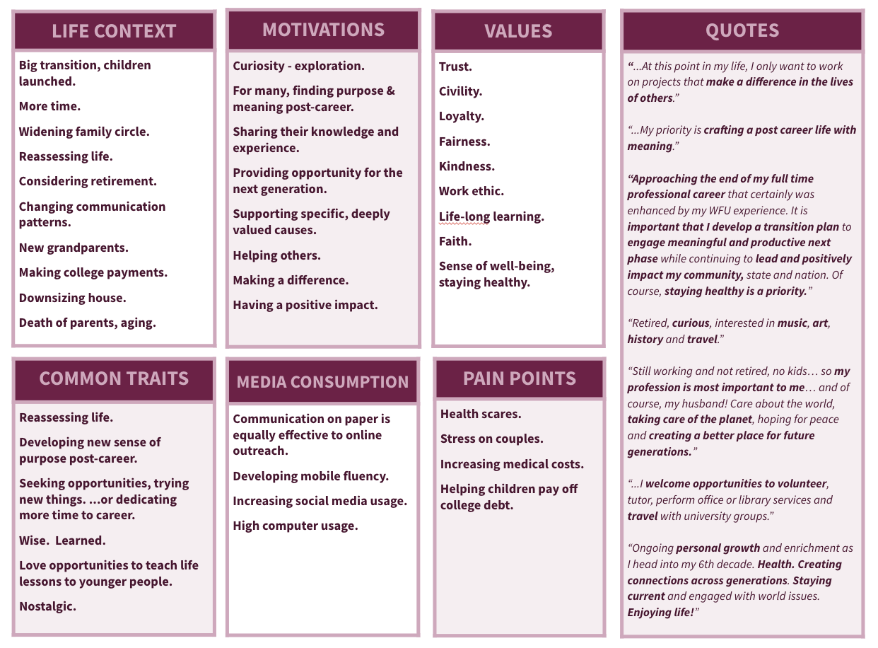
Persona: Seniors

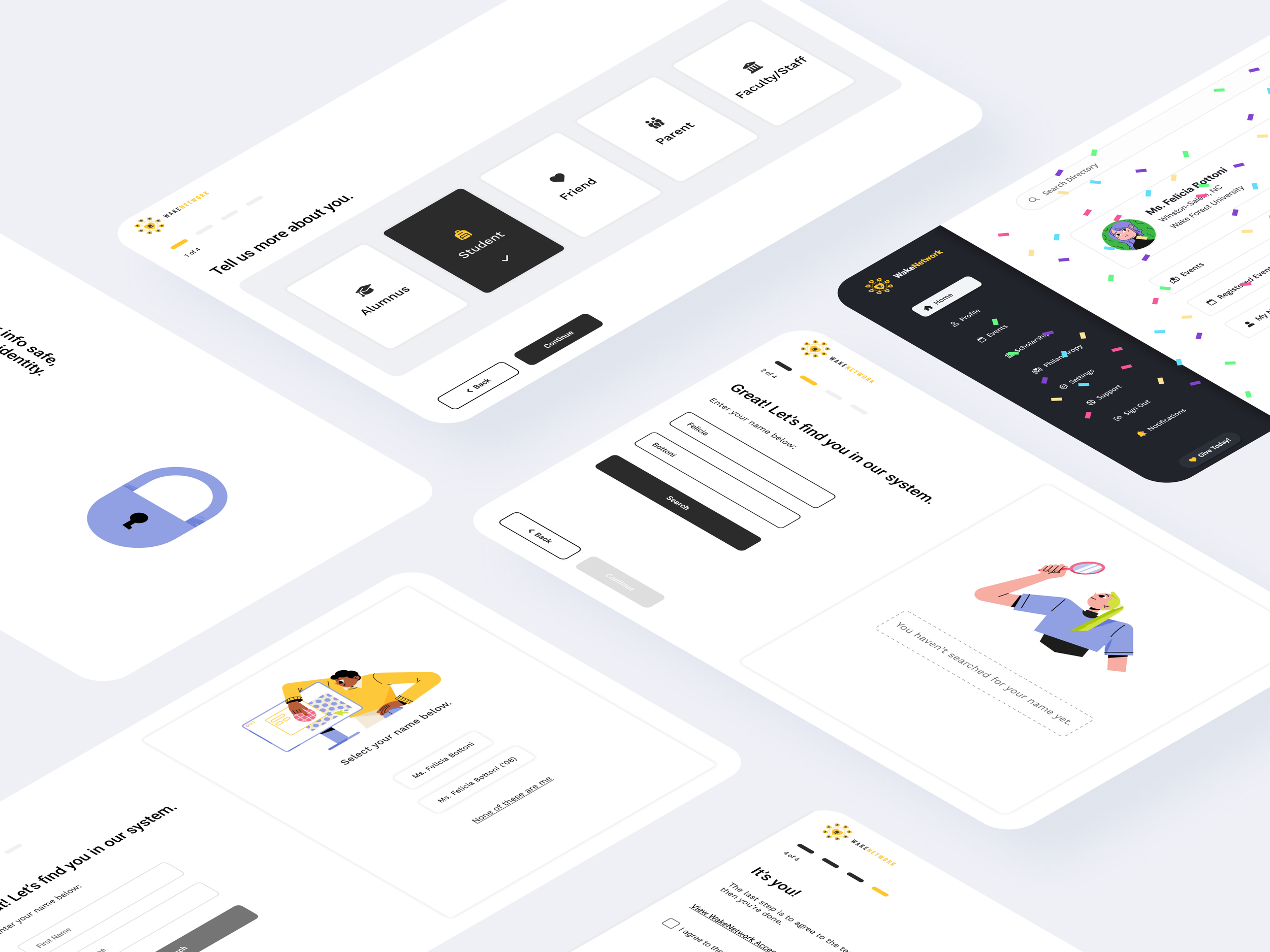
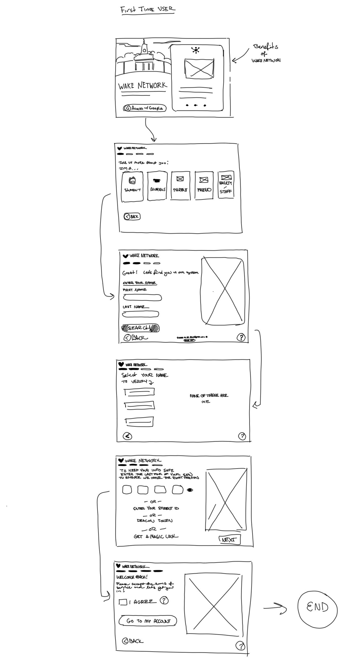
Sketches
A rough draft of the proposed user flow, and wireframe for the new onboarding process.
User flow inspiration from H&R Block.
This UI pattern from H&R Blocks’ self-directed online tax prep shows a multilevel progress bar, clear, simple language, large buttons, and a page that limits options for ease of use.
I used this UI pattern to guide our new user flow and design to make the onboarding experience easier for our Empty Nesters.

Old Experience
Old first-time user experience provided no path forward for users who had no SSN or student ID on file.
Final Design and User Flow


